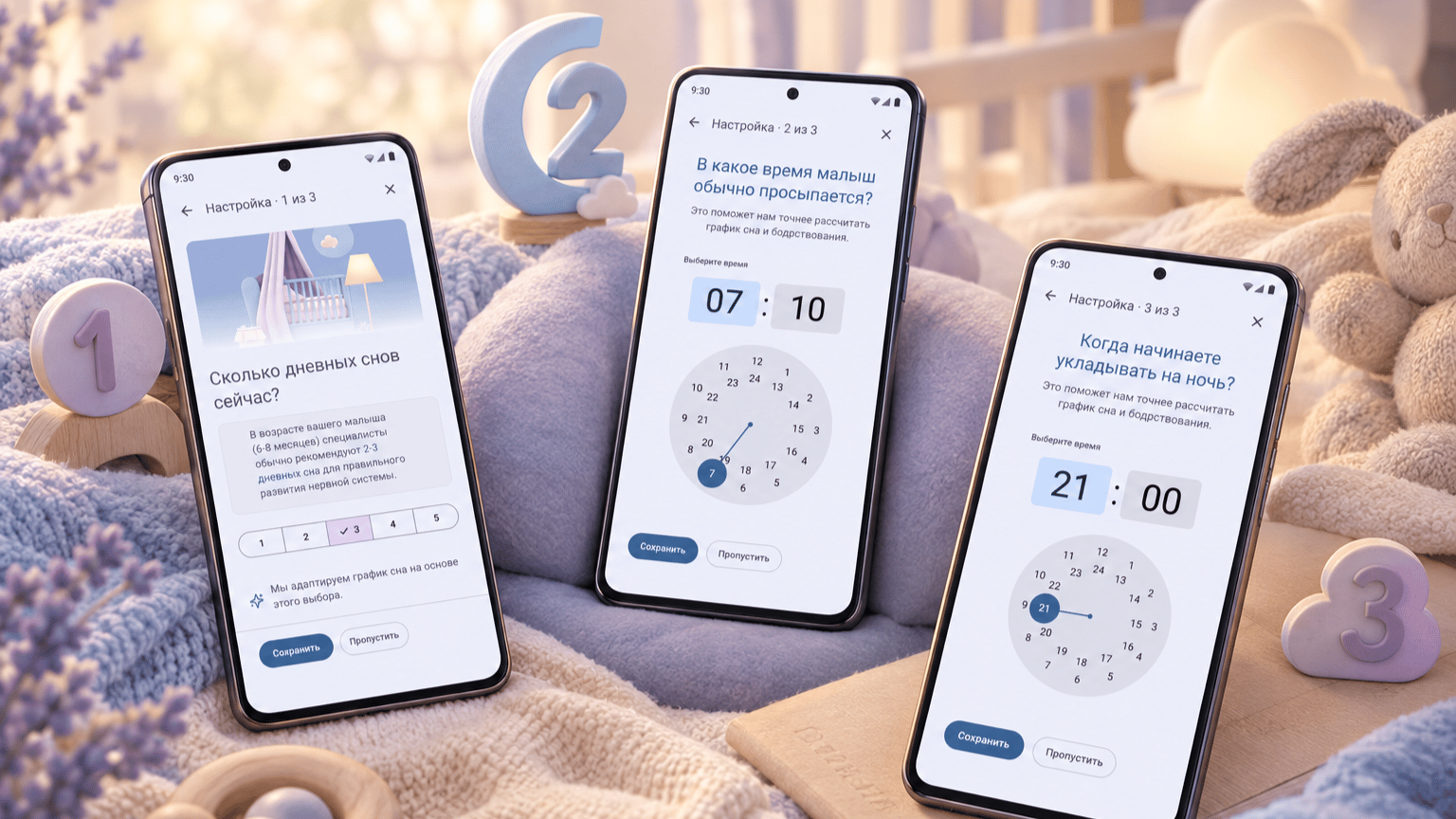
Leo Baby Care App - UX/UI Design Concept
A design concept for a baby care app, focused on authentication, onboarding, and sleep tracking. Created for parents of children in their first year.
The challenge
Parents caring for a newborn may need to record sleep and wake times while tired, distracted, or holding their baby. Lengthy setup flows, multiple logging steps, and unclear tracking states can make this routine harder to maintain. The design challenge was to simplify the path from first-time setup to daily sleep logging, while making it clear what is happening now and how to add or correct a missed event.
Goal
Design a calm, mobile-first experience that guides parents from authentication and onboarding to their first sleep record. The sleep tracker should make the next action clear, support both live tracking and retrospective entries, and provide a readable overview of sleep and wake periods. The focus was on a coherent design concept, not on validating sleep predictions or demonstrating improved sleep outcomes.
Target users
Russian-speaking parents of newborns and young infants, particularly first-time parents. The primary use context is brief smartphone interactions during everyday care, including nighttime use and situations where one hand is occupied. Their core needs are to record events quickly, check the current sleep status, and review or correct earlier entries without a lengthy setup process.
What the data revealed
The design process included a lightweight competitor and reference review, an interface and flow review of an existing application, and a review of product requirements. These activities informed the proposed authentication, onboarding, and sleep-tracking flows. No user interviews, surveys, or usability testing were conducted; assumptions about user needs and the usability of the proposed solutions remained unvalidated.
From blank page to structure
I adapted Material Design 3 rather than building a design system from scratch. Existing components, typography styles, and semantic color roles provided a consistent foundation within a short timeline. I complemented them with product-specific components for the sleep timeline, tracking controls, event history, and statistics.
The main principles were a focused onboarding flow, clear state-dependent actions, editable time entries, and a consistent distinction between recorded events and forecasts. The circular timeline was inspired by Napper and used as a way to explore the relationship between sleep and wake periods. These decisions remained design hypotheses, as the concept was not usability-tested.
Visual language & token system
I aimed for a gentle, welcoming visual identity without relying on conventional pink-for-girls and blue-for-boys styling. Lavender became the emotional theme of the palette, paired with muted blue accents and lightly tinted surfaces. For me, lavender evokes sleep, imagination, and a sense of possibility—a subtle connection between everyday parental care and a child’s unfolding future. Rounded shapes and restrained typography support this soft, approachable direction. The palette reflects my design intent rather than a validated psychological effect.



Color Tokens
What users taught me
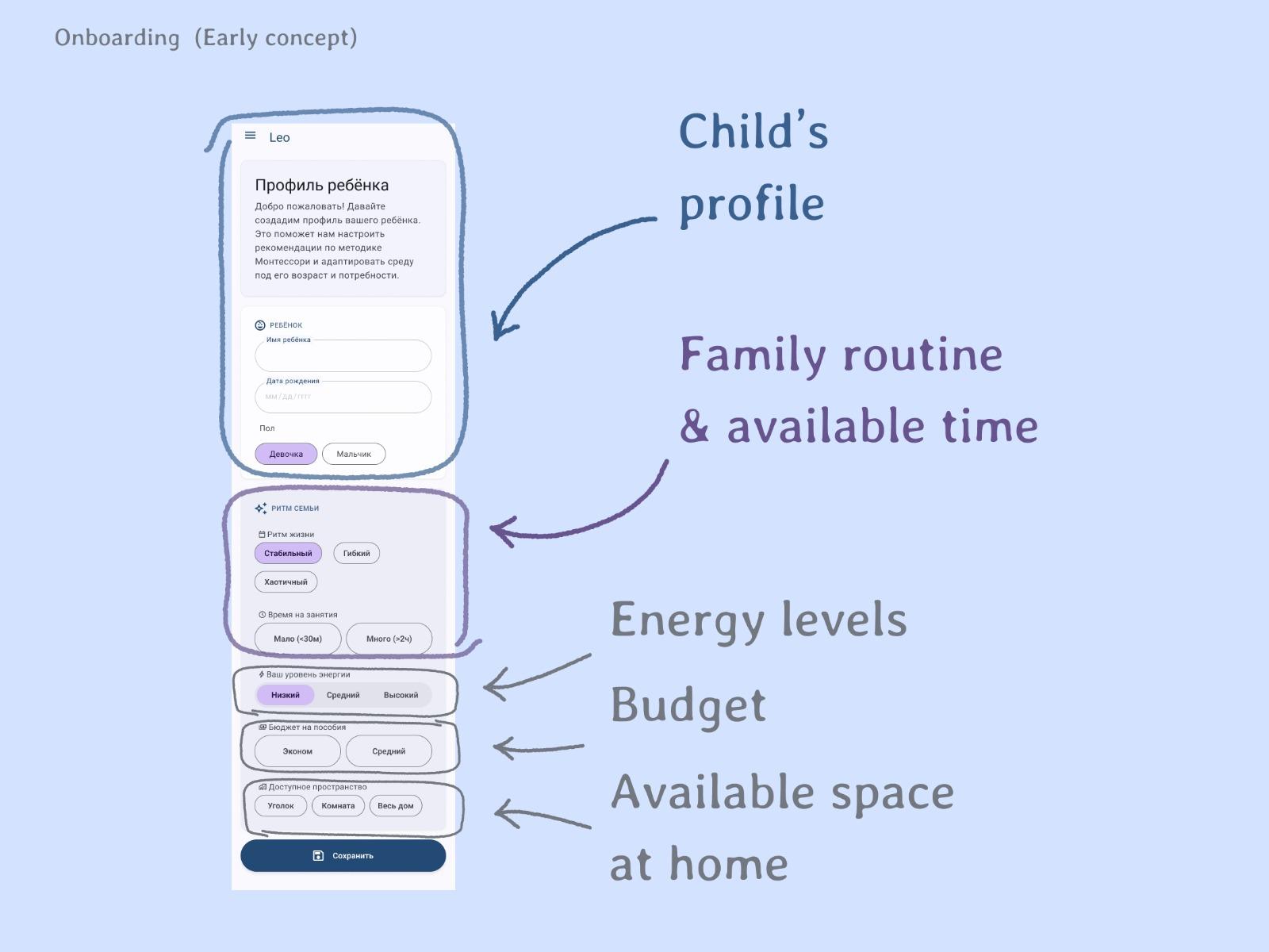
The early concept combined the child’s profile with questions about family routines, available time, energy levels, budget, and home space in a long scrolling form. It reflected a broader exploration of the product, but asked for information beyond what was needed to begin sleep tracking.
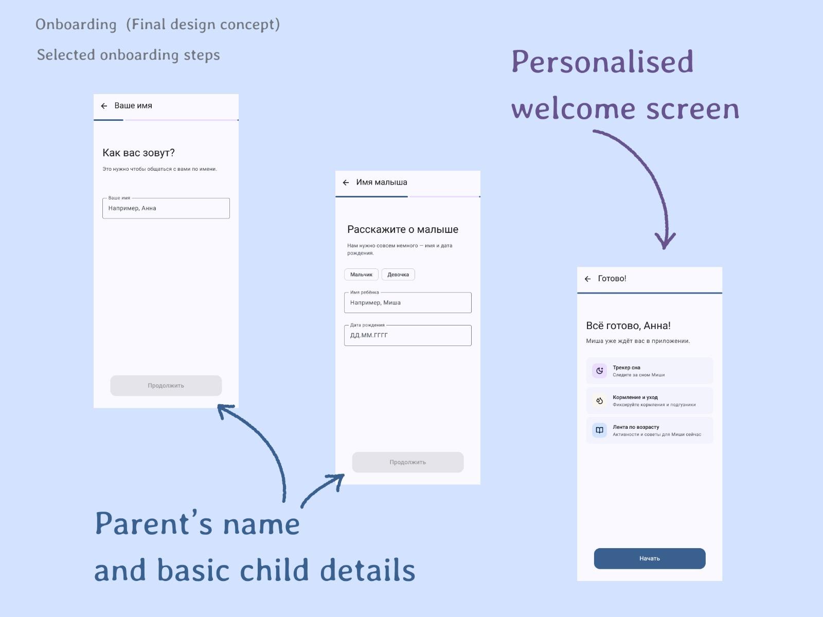
The revised concept separated setup into focused steps and narrowed the information request to the parent’s name and basic child details. Progress indicators and a personalised completion screen provided a more structured introduction. The intent was to reduce upfront effort; this was not tested with users.
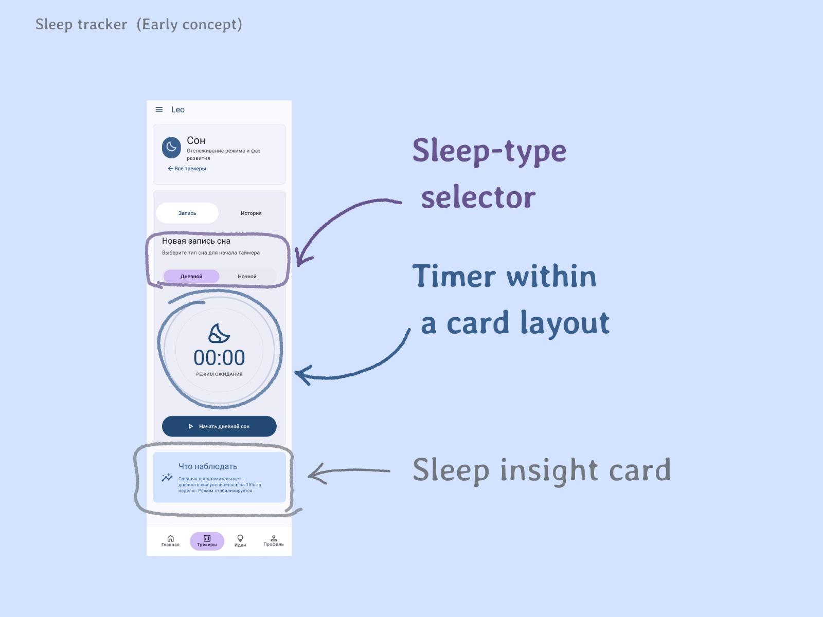
The early sleep-tracker concept placed a timer inside a card-based layout, alongside a sleep-type selector, introductory text, and an insight card. The screen combined logging controls with supporting content.
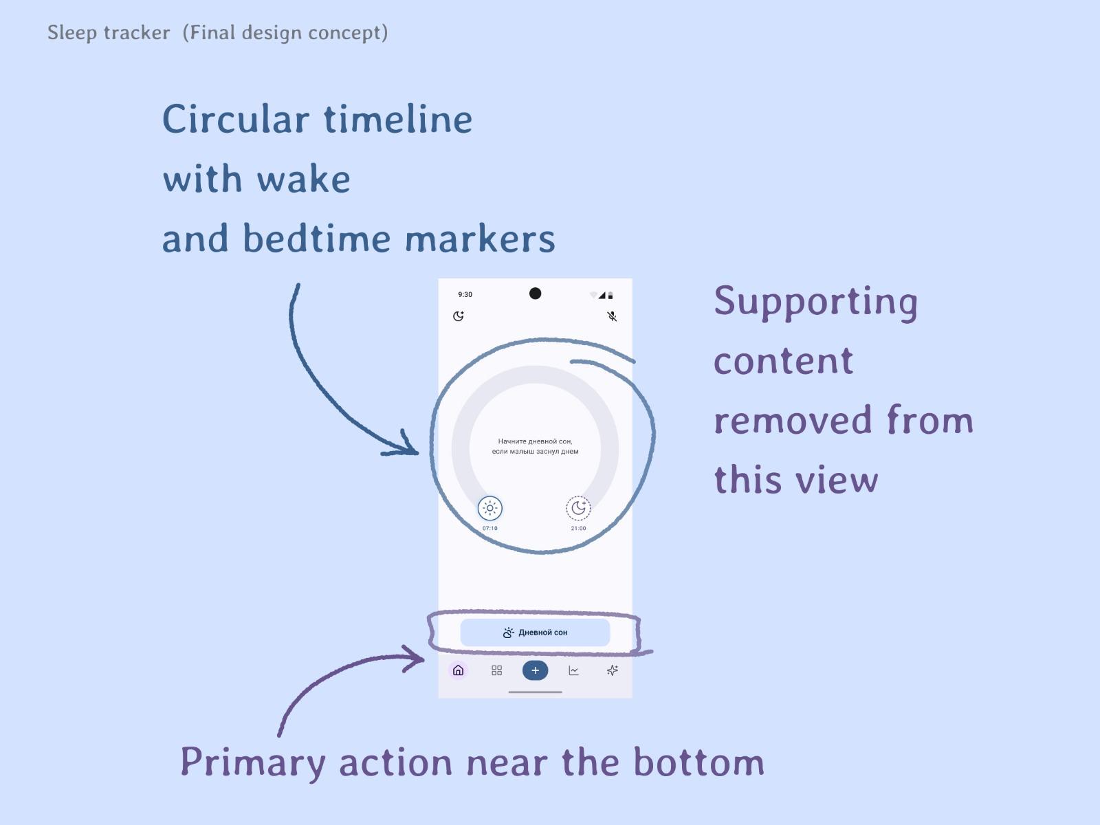
The revised concept made the circular timeline the main visual focus, with wake and bedtime markers and a dedicated action area near the bottom. Supporting content was removed from this view to prioritise the current state and next action. The timeline’s readability remained a hypothesis requiring usability testing.
The Finished Product
The final deliverable was a design concept covering authentication, onboarding, and sleep tracking for a baby care app. It included first-time setup, daytime and nighttime tracking states, editable sleep records, event history, and summary statistics.
Built on Material Design 3, the interface combined a soft lavender-and-blue palette with reusable product-specific components. The onboarding concept narrowed the initial information request, while the sleep tracker explored a circular timeline inspired by Napper to bring time and tracking status into one view.
The work provided a more detailed design proposal for further discussion and development. Its usability and product impact were not measured, so the case study presents design decisions and intended benefits rather than validated outcomes.
Designed authentication, onboarding, and sleep-tracking flows
Narrowed onboarding to the parent’s name and basic child details
Created reusable components for sleep-tracking states and event history
Focused onboarding
Before
A long form combined child details with questions about family routines, time, energy, budget, and home space.
After
Focused steps requested the parent’s name and basic child details, followed by a personalised welcome screen.
Sleep-tracking layout
Before
A card-based screen combined a timer, sleep-type selection, and supporting insight content.
After
A circular timeline became the main focus, with wake and bedtime markers and a dedicated primary action near the bottom.
What I learned
This project reinforced the importance of defining the essential user journey before expanding the interface. Working with an existing design system and AI-assisted tools helped me explore and refine ideas within a short timeline, but visual consistency alone could not establish usability. The key lesson was to make each state and next action explicit—and to distinguish design intent from validated outcomes.
Let's work together.
Let's discuss how we can streamline your product experience and craft something users will love.